FGD Psychological Services: a brand that feels safe to reach out to
A new identity and website for a therapy practice in Lagos. We explored two brand directions, built a complete identity around the one the practice chose, and designed and built a website where booking a first session takes a few calm minutes.
- Client
- FGD Psychological Services
- Industry
- Mental health
- Location
- Lagos, Nigeria
- Year
- 2026
- Services
- Design, Development
- Platforms
- Web
2
Brand directions explored
13
Brand applications, from card to billboard
6 steps
From “what do you need?” to booked and paid
Overview
Care that deserved a brand to match.
FGD Psychological Services is a therapy practice in Lekki, Lagos. Its psychologists see individuals, couples and families in person and online, and run wellbeing seminars and workshops for organisations. Clients come from across Nigeria and from Nigerians abroad in Europe and North America.
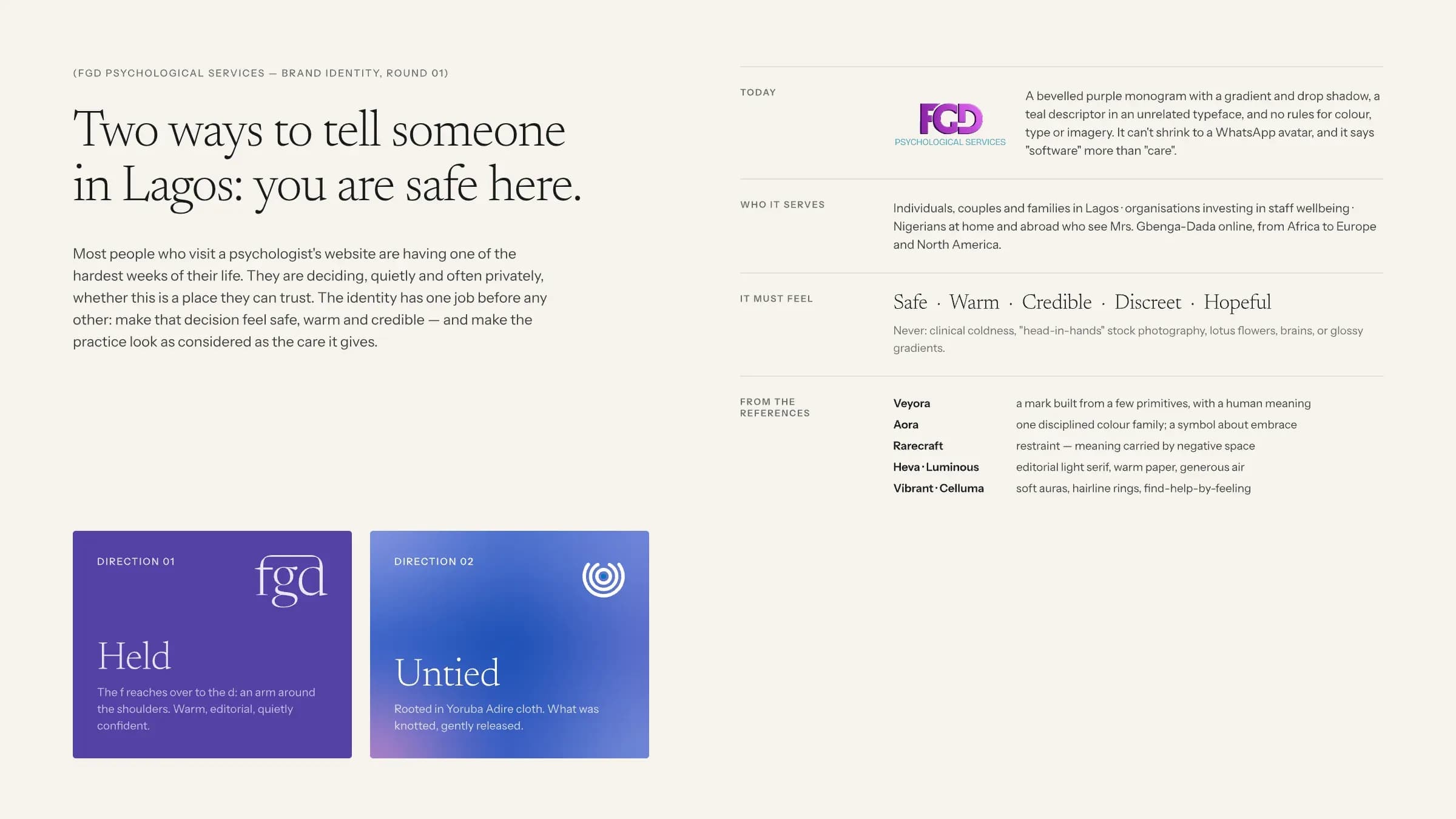
The care was excellent. The brand was not: a bevelled purple monogram with a gradient and drop shadow, a descriptor in an unrelated typeface, and no rules for colour, type or imagery. It could not shrink to a WhatsApp avatar, and it looked more like software than a place of care. We were asked for a new identity and a new website.
The challenge
Most visitors are having one of the hardest weeks of their life.
Someone looking at a psychologist’s website is often deciding, quietly and privately, whether this is a place they can trust. In Lagos, where talking about mental health still carries stigma, that decision is even harder. The identity had one job before any other: make that decision feel safe, warm and credible.
The brief ruled some things out from the start: clinical coldness, “head in hands” stock photography, lotus flowers, brains and glossy gradients.
It had to feel
Safe and discreet
Warm and hopeful
Credible, as considered as the care itself
Rooted in Lagos, not borrowed from a template
Two directions
Held, or Untied.
We presented two complete directions, each with a logo suite, colour, typography, a complimentary card and real applications, so the choice was about meaning rather than a single logo.
Direction 01: Held
A wordmark in Newsreader, a warm editorial serif, with one change: the shoulder of the f keeps going, reaches across the g and comes to rest on the d. An arm around the shoulders, a doorway, a roof. It reads first as a name, then slowly as a gesture.
Direction 02: Untied
A symbol rooted in Adire, the indigo resist-dyed cloth of the Yoruba: rings that loosen around a protected centre, with a soft aura of colour instead of flat blocks. Local, modern and calm.
The practice chose Untied.
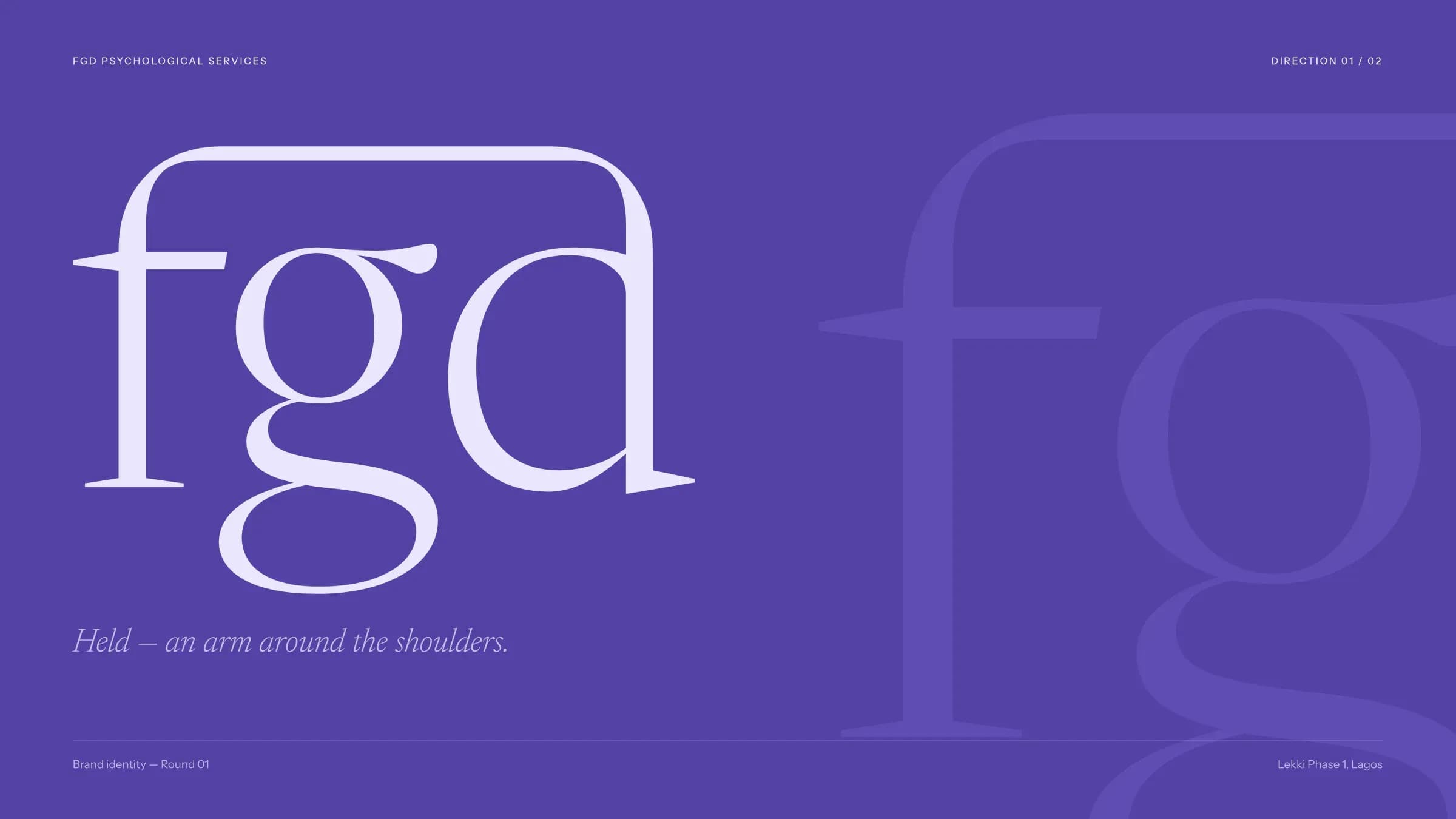
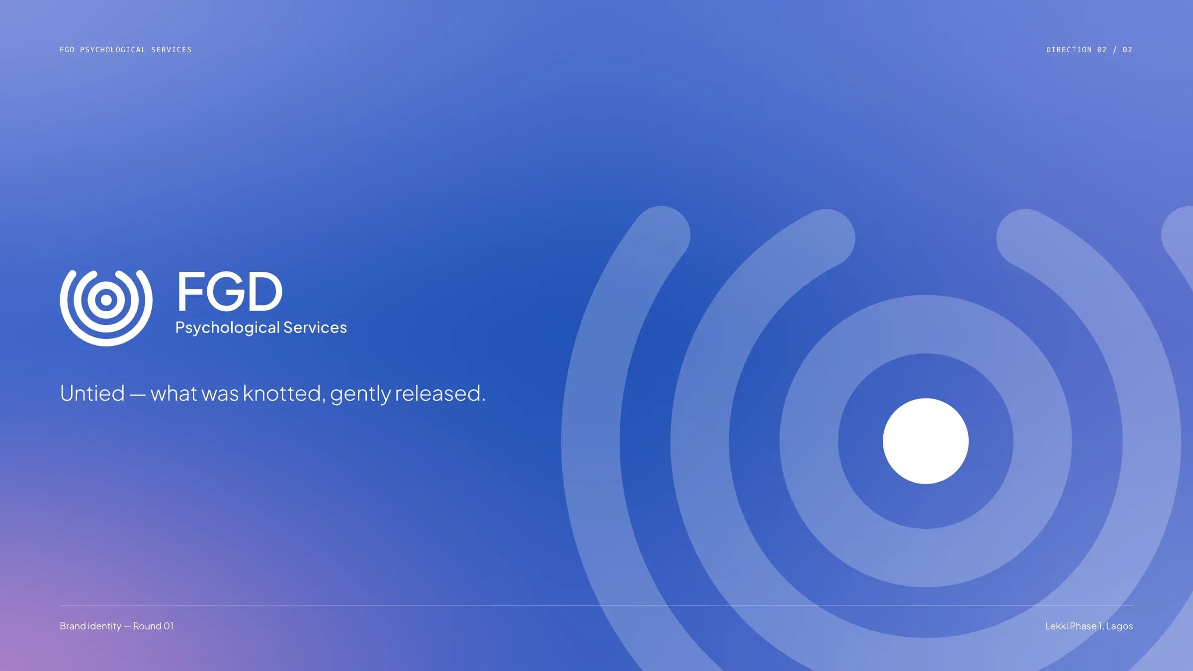
Direction 01, Held (left) and Direction 02, Untied (right).
The idea
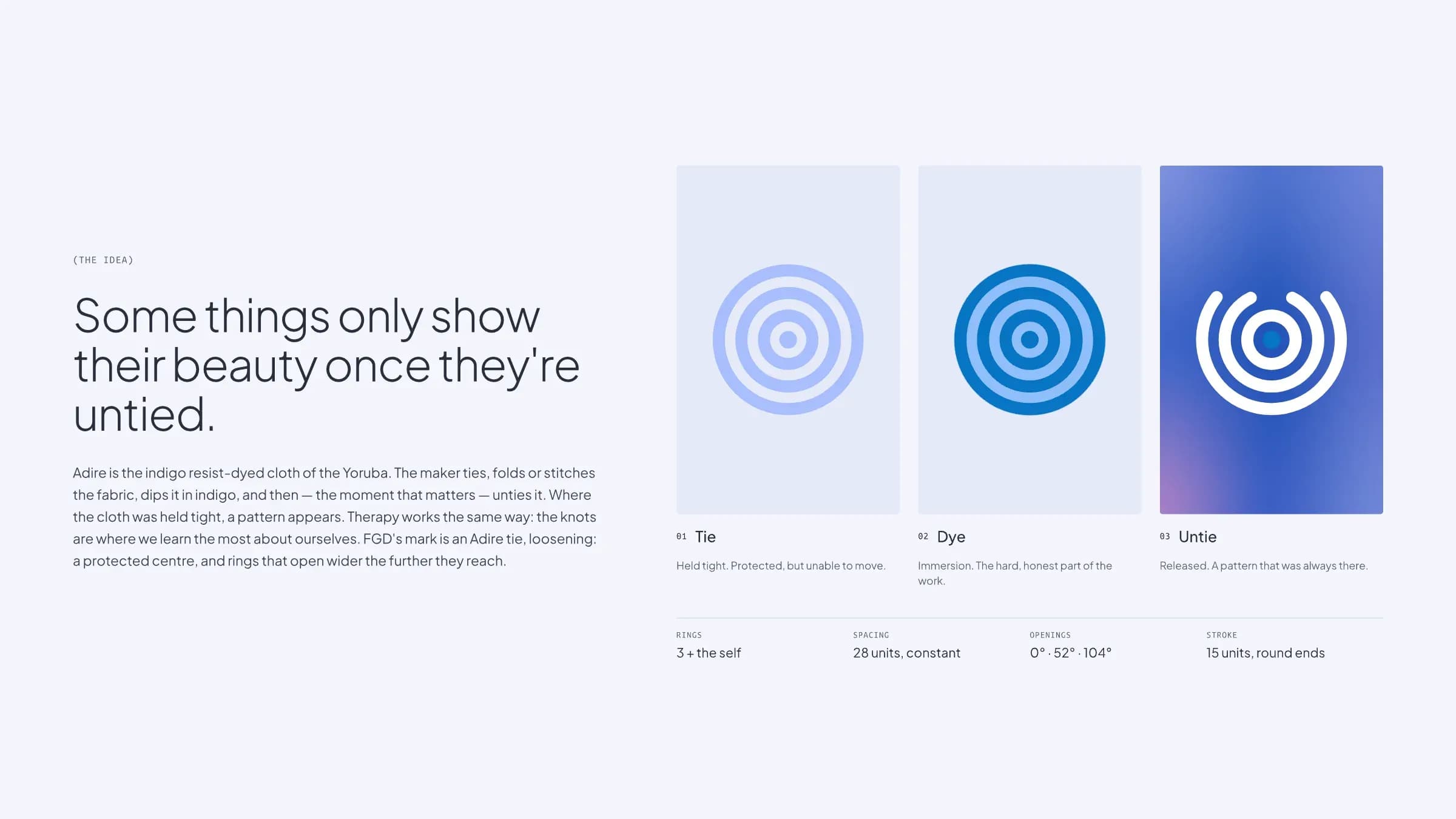
Some things only show their beauty once they’re untied.
To make Adire, the maker ties, folds or stitches the cloth, dips it in indigo and then, the moment that matters, unties it. Where the cloth was held tight, a pattern appears. Therapy works the same way: the knots are where we learn the most about ourselves.
FGD’s mark is an Adire tie, loosening: a protected centre, the self, and three rings that open wider the further they reach.
- Tie. Held tight. Protected, but unable to move.
- Dye. Immersion. The hard, honest part of the work.
- Untie. Released. A pattern that was always there.
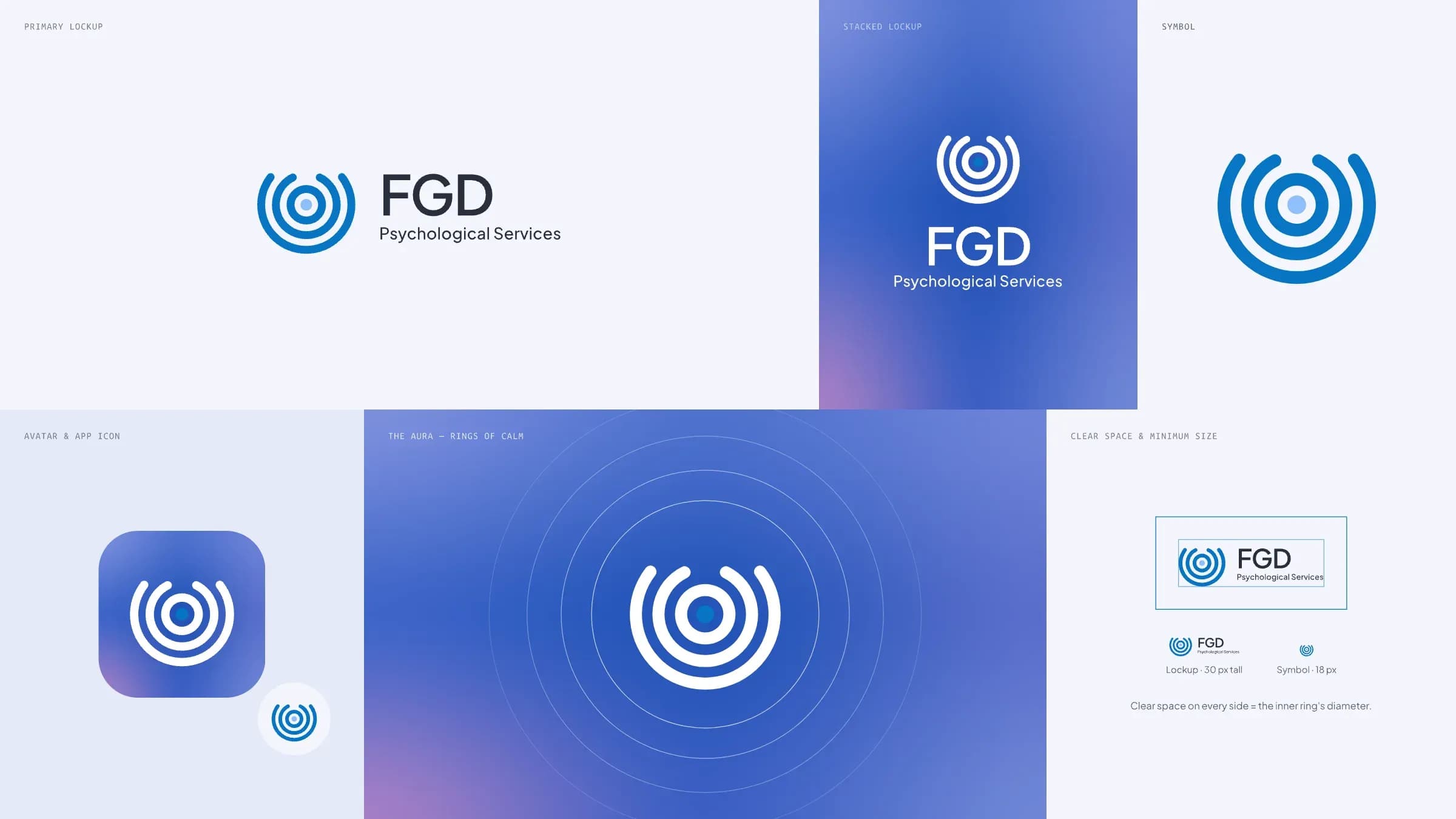
Logo
A mark built from rings and a self.
The symbol is drawn on a strict system: three rings plus the self, 28 units apart, with openings at 0°, 52° and 104° and a 15-unit stroke with round ends. It holds up as a 30-pixel lockup and an 18-pixel symbol, which matters for a practice that meets many clients first on WhatsApp and Instagram.
The name is set in Plus Jakarta Sans Semibold, with no custom letterforms: the mark does the talking.
Colour & type
An aura, not a colour block.
Periwinkle, lavender and blush blend into one soft, iridescent aura, with Vibrant Blue as the single solid voice for the mark, buttons and links. Slate on Mist passes WCAG AAA, so text stays easy to read for everyone.
Plus Jakarta Sans Light carries the headlines, Regular the text, and Ubuntu Mono the small labels and data.
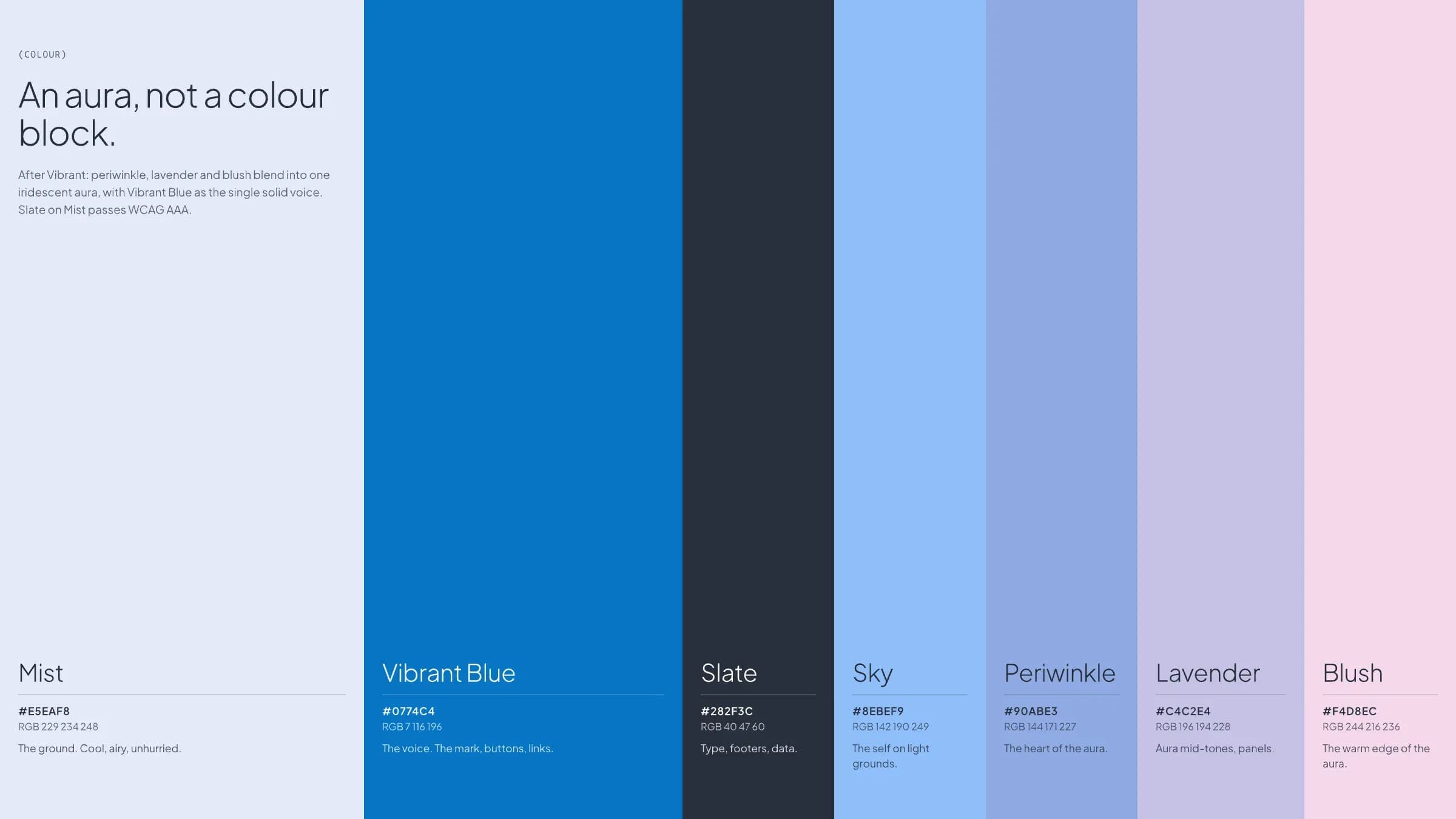
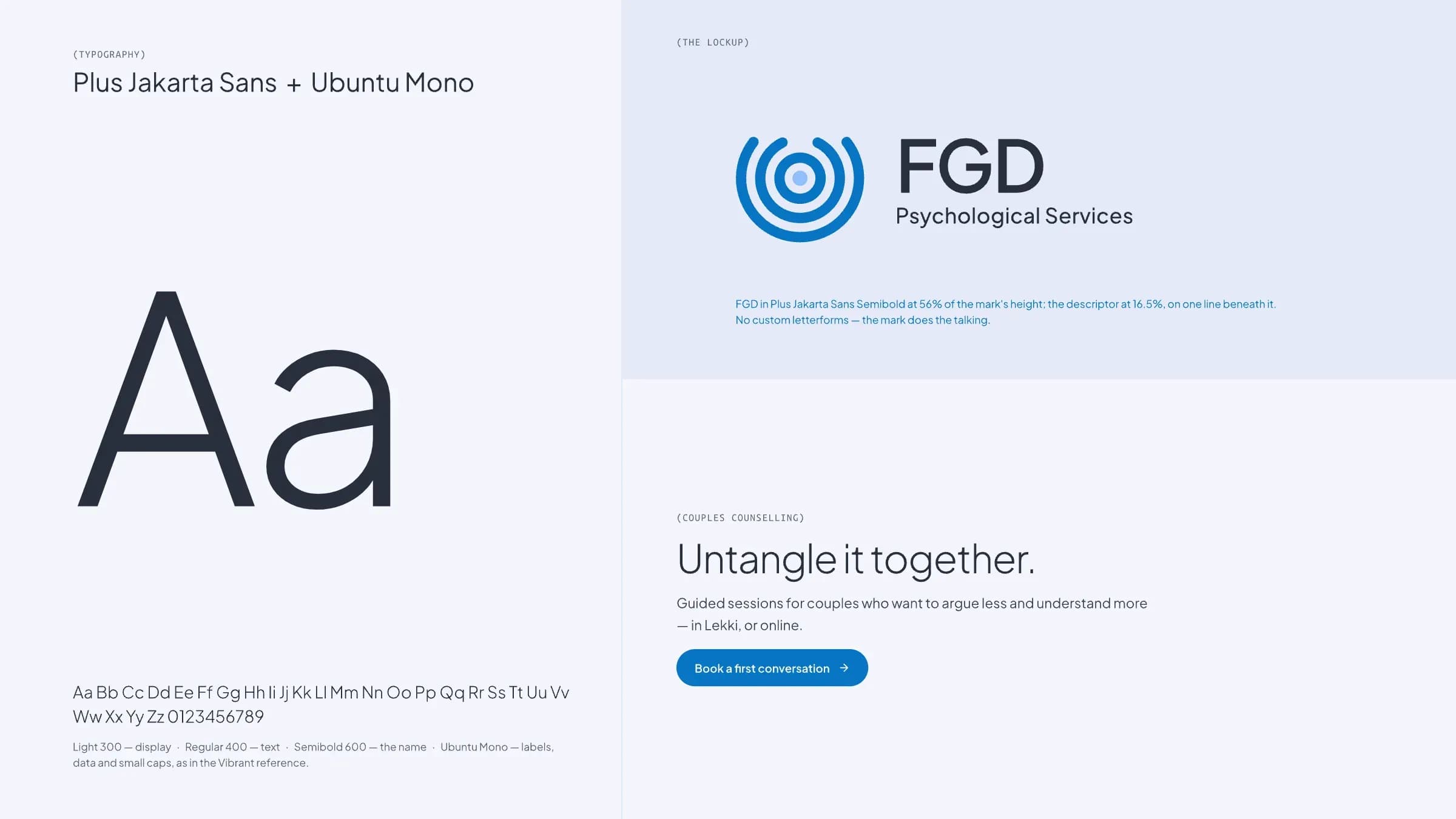
Seven colours and two typefaces.
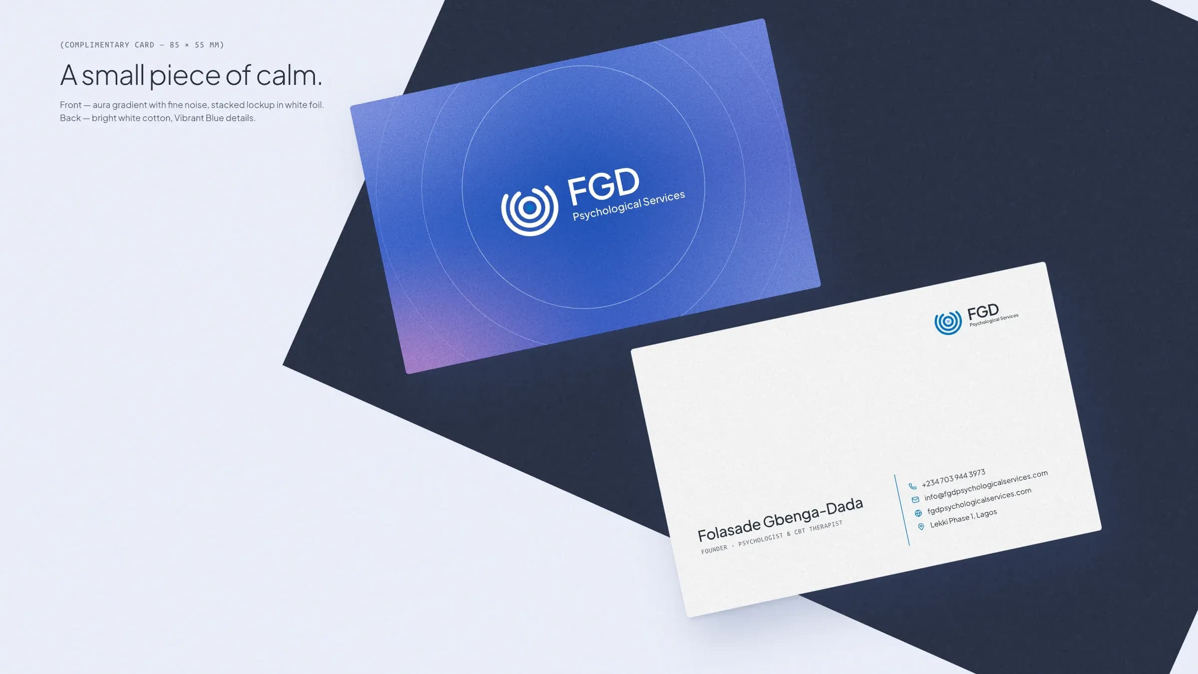
Complimentary card
A small piece of calm.
The aura on the front, the details on a clean white back. Something a client can keep in a purse without it announcing what it is.
Out of home
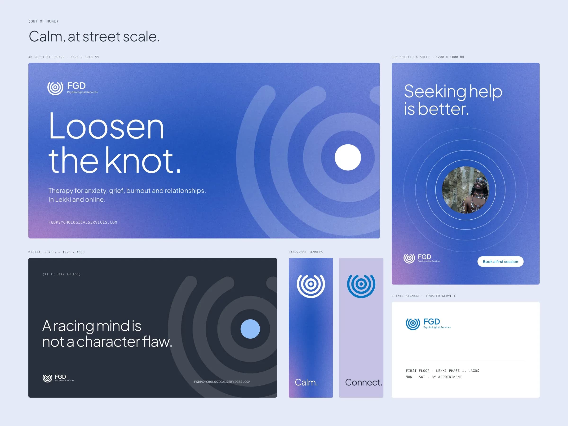
Calm, at street scale.
Lagos is loud. The outdoor work does the opposite: one gentle line, the rings and a lot of space. A 48-sheet billboard, a bus shelter poster, a digital screen for the evening commute, lamp-post banners and frosted signage for the clinic door.
Website
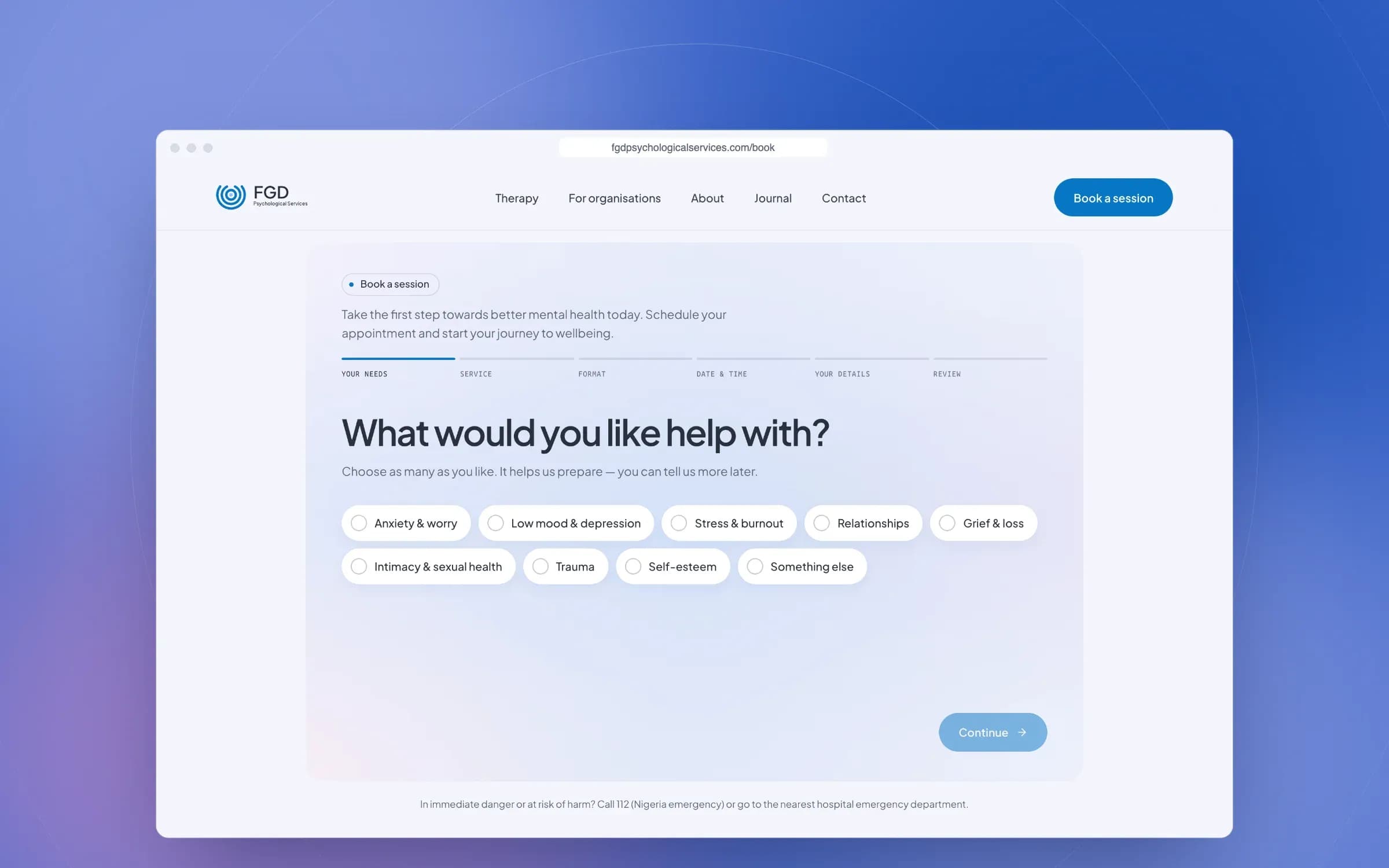
Booking a first session, in a few calm minutes.
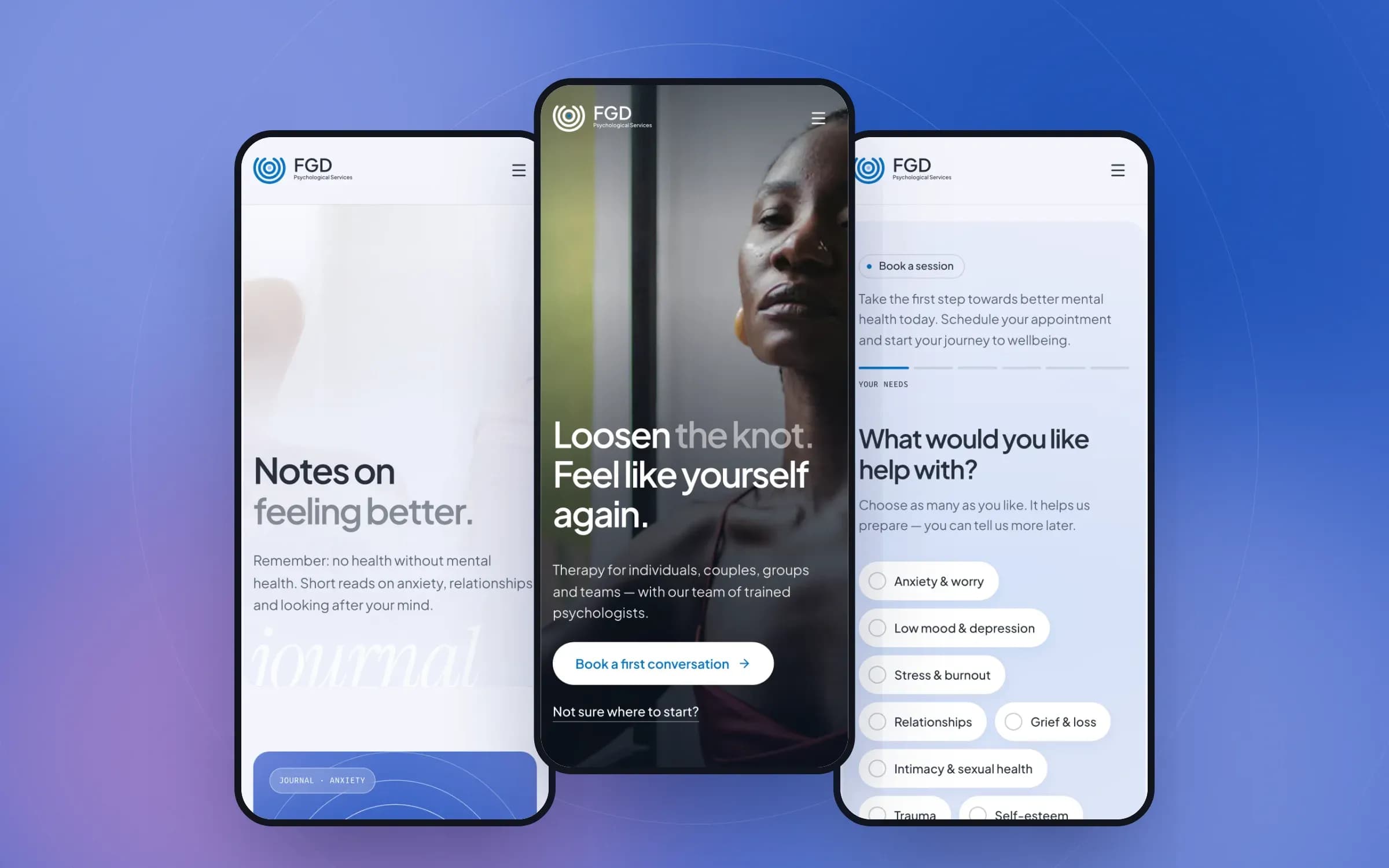
The website carries the brand into the place most clients meet it first. It opens with a promise, “Loosen the knot. Feel like yourself again.”, and then offers two ways in: one for people and couples, one for organisations.
Booking is a six-step flow that starts with how someone feels, not with a calendar: what they need help with, the service, in person or online, a time in Lagos time, their details and a review. If a session has a fee, it is paid securely with Paystack and confirmed on the server.
Services, a journal and a page for organisations, all managed in a CMS
Booking with live availability, minimum notice and days off
Paystack payments, confirmed by webhook
Redirects from the old WordPress site, so no search traffic was lost
Technology
Simple to run, quick to load.
The practice edits everything themselves, from services and fees to opening hours and journal posts.
Website
- Next.js
- React
- TypeScript
Server-rendered pages with structured data for every service, article and FAQ.
CMS
- Payload CMS
- PostgreSQL
Services, journal, testimonials, FAQs, bookings and enquiries in one admin.
Payments
- Paystack
Fees paid at booking, verified on the server and by webhook, never from the browser alone.
Where it is now
Live, and growing.
The new identity and website are live at fgdpsychologicalservices.com.
What we delivered
- Two brand directions, and a complete identity for the chosen one
- Logo suite, colour, typography and usage rules
- Complimentary card, social and journal templates and out-of-home designs
- Website design and development, with a CMS
- Online booking with Paystack payments
- Content migration and redirects from the old WordPress site
Team
- Brand designer
- Product designer
- Full-stack developer
Have a product to build?
We take founders from idea to a live MVP in weeks, with senior design and engineering and AI in every step.
Next case study
Building PayIQ: one money platform for people and small businesses, with an AI assistant at its core
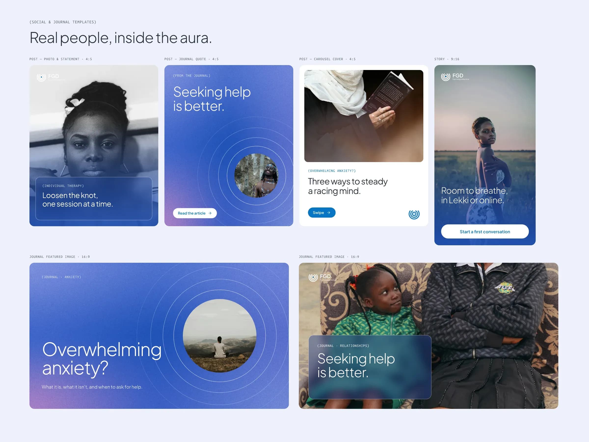
Social & journal
Real people, inside the aura.
Templates for Instagram posts, stories and journal covers that the practice can fill in themselves. Real people, photographed warmly, sit inside the rings, and every post leads back to the journal or a first conversation.